Following App Store screenshot best practices, sizes, guidelines, and requirements is crucial for app listings on Apple’s marketplace. Effective screenshot designs are essential as they attract users and promote app downloads in a highly competitive environment (more than 2 million apps) where users spend an average of 7 seconds per product page.
If your app screenshot spots a lackluster design, users will scroll to the next competing app’s product page and choose differently. While visual appeal is essential, Apple imposes certain restrictions and guidelines for screenshot submissions. If you fail to adhere to such guidelines, you can’t complete the submission.
We structure this article into 2 parts to address common questions tech companies ask when submitting apps. First, we share Apple's technical requirements for a successful app screenshot submission. Then, we explore best practices for creating attractive screenshots to improve app download rates.
Apple App Store Screenshot Requirements
Apple App Store Screenshot Guidelines
Apple’s guidelines on app screenshots are straightforward. First, it limits each app to 10 screenshots for each localized listing. For example, you can have different versions of screenshots for the French audience instead of the same ones used to target English-speaking users.
You may or may not use up the 10 screenshots quota as it depends on your app’s features, brand message, and unique appeals. With that said, try to use as many slots as possible to attract and convince users to download your app.
Apple is strict about how the screenshots are taken. It allows app developers to use images or videos captured directly from within the app. In other words, you can’t submit screenshots taken from an external camera or those not originally shown in the app.
Lastly, Apple requires all screenshots to be submitted in PNG, JPEG, or video format. The screenshots must fall under one of the 3 mandatory formats defined in the requirements. Namely, they must fit the 6.7” iPhone, 5.5” iPhone, or 12.9” iPad. We provide further details about screenshot size requirements below.
Screenshot Sizes and requirements for iOS Devices
Apps listed on App Stores are accessible to iPhone, iPad, Mac, Apple TV, or Apple Watch. Apple recommends that app developers provide screenshots for each iOS device and the corresponding model the app runs on. While this is not mandatory, the below screenshots are, according to the latest Apple guidelines.
- 6.7-inch iPhone, with relevant landscape and portrait screenshots.
- 5.5-inch iPhone, with suitable landscape and portrait screenshots.
- 12.9-inch iPad, with the associated landscape and portrait screenshots.
Apple uses the above screenshots as a source for other iOS devices that weren’t submitted with one. For example, Apple requires you to submit 6.7” screenshots for iPhone Pro Max. It then scales the 6.7” screenshot down to 6.5” for devices like iPhone 14 Pro and iPhone 11. Alternatively, you can upload 6.5” screenshots for the respective devices. The same applies if you’re uploading videos instead of screenshot images.
If you’re publishing apps for Mac, AppleTV, and Apple Watch, you must submit screenshots in one of the listed resolutions. Apple cannot downscale screenshots from other sources for these devices. For example, app screenshots for Apple TV must be in either 1920 x 1080 pixels or 3840 x 2160 pixels.
We show tables listing Apple’s screenshot size requirements and the respective sources or alternatives below.
App Preview video Sizes & Guidelines
Apple allows developers to submit videos, known as app previews, to make their app listings more engaging. It provides specific guidelines on the video format. Basically, you can submit videos in tH.264 and ProRess 422 (HQ only) in resolutions similar to the screenshot guidelines. Your video must fall between 15 to 25 seconds and be limited to 500 MB in file size.
For each listing, you can submit up to 3 videos, either in portrait or landscape format. Each video, or app preview, takes up a screenshot slot. Depending on its orientation, the video might replace the first screenshot on the product page. For example, videos in portrait format will be shown on the app listing’s first position, while those in the landscape orientation will only appear on the app store’s search results.
Like image screenshots, Apple restricts the app preview videos to on-screen recordings. In other words, you can’t submit a 3rd party captured video or digitally rendered promotional videos to the App Store. Also, bear in mind that Apple prohibits copyrighted materials in the submissions.
Best practices for App Store screenshots
Tips, insights, and trends in App Store screenshots
Screenshot designs are one of the major factors in attracting users, increasing conversions, and boosting app store optimization (ASO). When creating screenshots, remember that users glance over different apps in seconds. Hence, capturing their attention with the right design elements is crucial.
These are some helpful tips.
1. Storify your screenshots.
Instead of submitting fragmented or unrelated screenshots, use them to narrate your brand, value, or story in ways that resonate with the users. For such an approach, the AIDA framework might help. When applied, it takes users through a series of screenshots designed to instill attention, interest, desire, and action.
For example, a productivity app attracts attention using a screenshot showing a colored and organized project management timeline. Also, including catchy headlines helps grab the user's attention and interest.
2. Make the first screenshot counts
The first screenshot is readily-visible to users browsing through apps. Therefore, it must portray and convey the key features, benefits, or values in the most compelling manner. Besides the mesmerizing visuals, it should convince users to stop, explore and download the app.
We recommend using a video app preview as the first screenshot for some apps. For example, Starbucks uses a preview video to showcase useful app features, including ordering, payment, and rewards.
3. Use readable text
Use reasonably large fonts to ensure the texts are visible across all devices. Consider that users might be using different devices when browsing app listings. To get the message across, choose a simple design and prevent cluttering the screenshots with unnecessary text. Doing so avoids overwhelming users with too much information, which decreases the install rate.
4. Create professional-looking screenshots.
Don’t settle with merely submitting raw screenshots of your app. While that’s the minimal requirement, consider enhancing the screenshots with high-quality backgrounds or relevant images. For example, combine colors, typographies, and styles to create attractive screenshots that convert.
5. Focus on the unique value proposition
The screenshots should state a clear and valuable unique value proposition. Are they crafted to convey specific emotions, such as joy, calmness, urgency, or relaxation? Will users feel motivated to download and try the app after viewing the screenshots?
For example, iOS games use video app previews to provide a glimpse of the gameplay, which brings users excitement and increases downloads.
6. Localize the screenshots
Don’t assume that users in all regions share similar pain points or will be inspired by the same message. Instead, study the different markets you’re targeting and create unique sets of screenshots for the respective audience. For example, you use in-app images in Italian languages when localizing the app for users in Italy.
7. Highlight social proof
Don’t hesitate to feature awards, accreditations, and other achievements in your screenshots. For example, if your app was listed in App Store Awards, proudly mention that it’s an award-winning app and include the appropriate badge.. Non-official achievements, such as hitting 1 million downloads, are also convincing social proof. Gracing your screenshots with these social proof encourages hesitant users to try the app.
8. Choose the right screenshot orientation
Most apps use portrait orientation in their screenshots, but it’s not necessarily a norm. When choosing between landscape and portrait, consider the nature of the app and its purpose. For example, most games are designed to work in a landscape format and, therefore, use landscape screenshots.
However, landscape screenshots take up precious screen space compared to portrait ones. In some cases, developers might use portrait screenshots to optimize space usage. For example, they use vertical screenshots to display more features on the screen.
9. Implement new iOS features
While this is not directly related to screenshot designs, implementing new iOS features might increase app visibility on App Store. For example, adding the dark mode and highlighting the feature in your screenshot may increase the app’s in-store ranking.
App screenshots examples
We share apps that optimize their screenshots effectively for Apple App Store below.
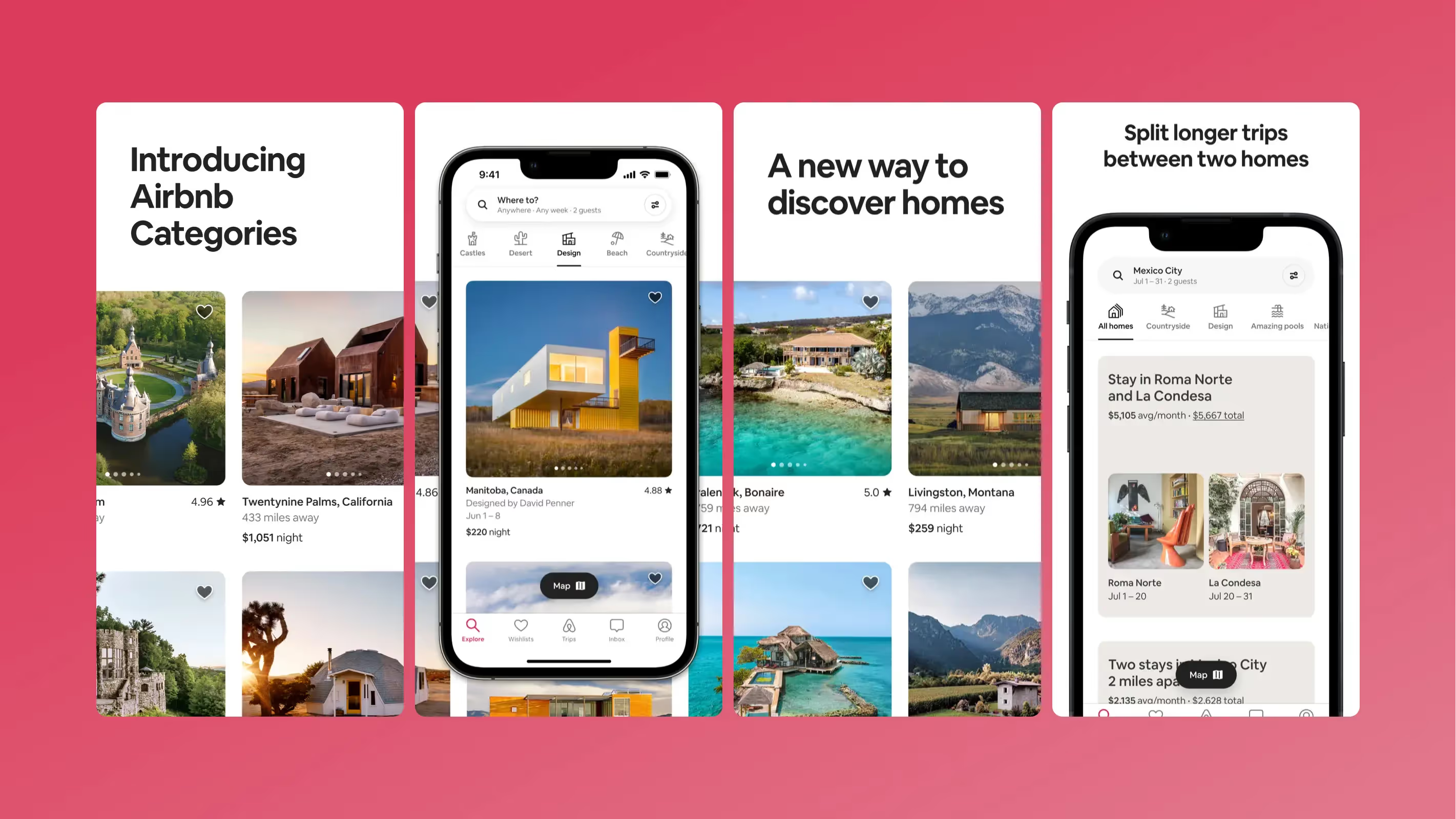
Airbnb
Airbnb combined short phrases and purposeful words with consistent brand colors. They also featured cross-frame images for the first 2 screenshots, which subtly conveys creativity.
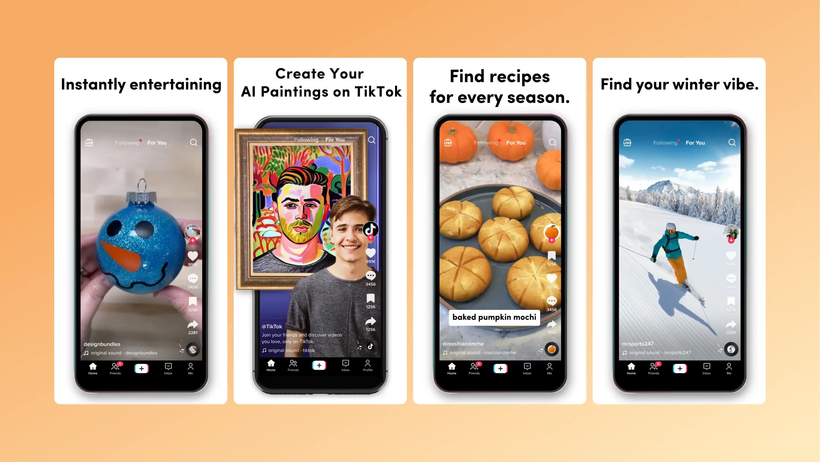
Tiktok
TikTok successfully conveys a strong, unique value proposition by matching app experiences with relevant screenshots.
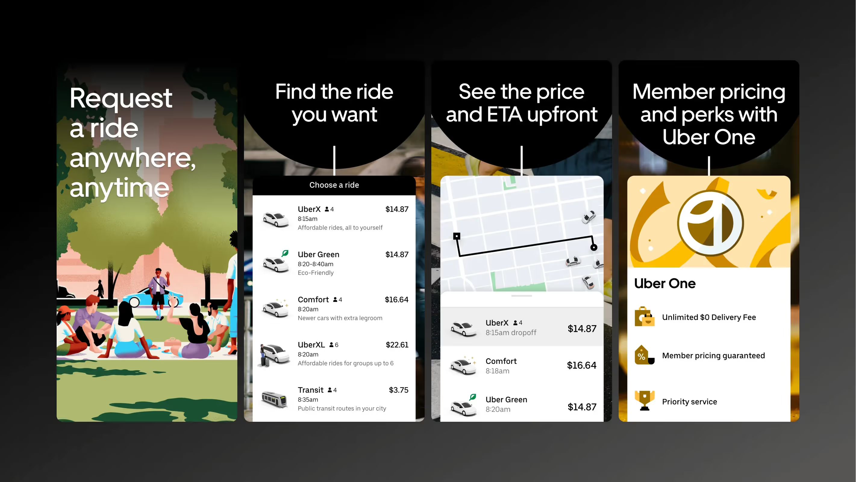
Uber
Uber opted for a minimalist black-and-white backdrop with screenshots showing key features of the app.
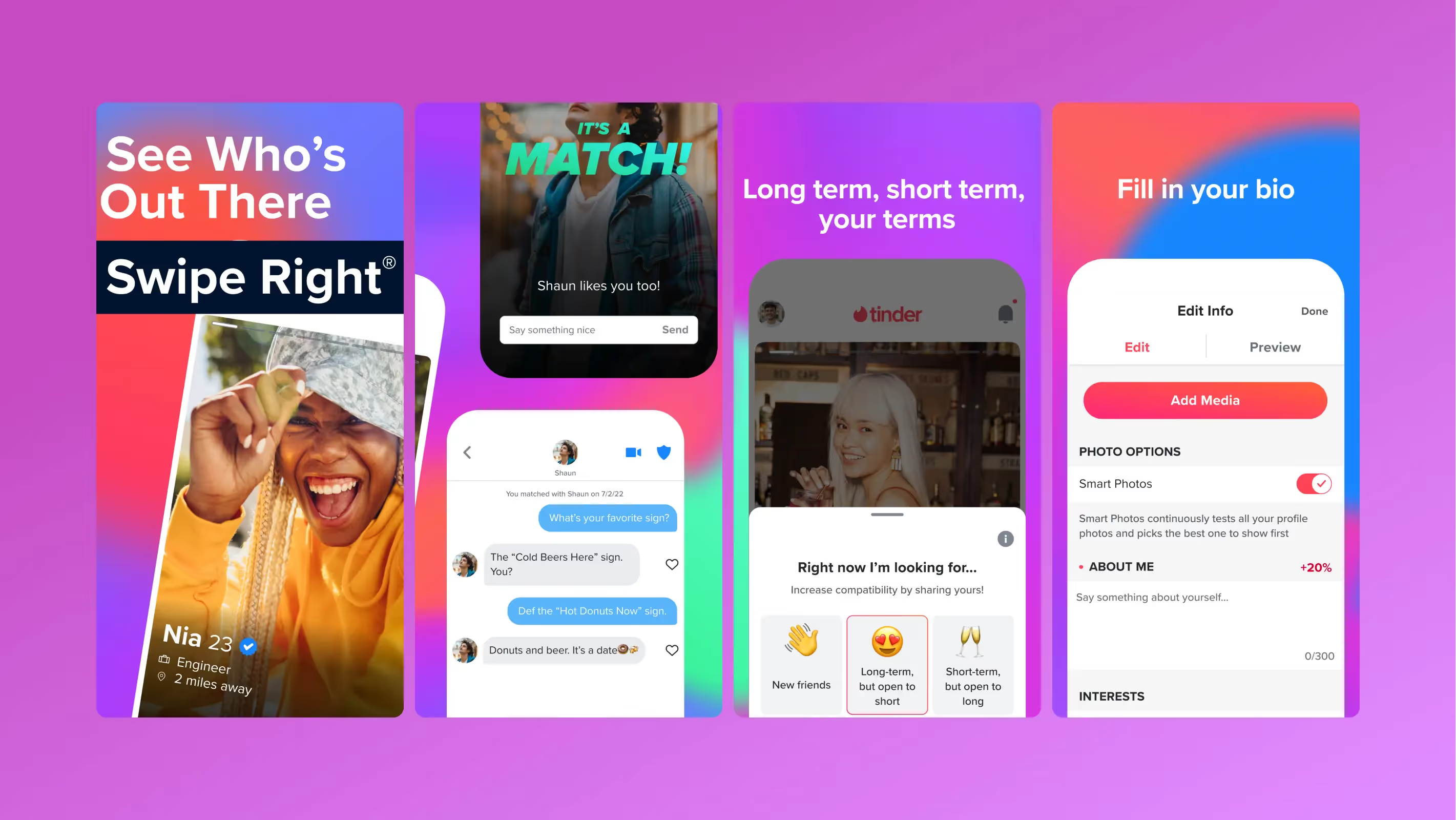
Tinder
Tinder kept textual elements to the minimum and featured its users in the screenshots to attract more subscribers.
Dyvo
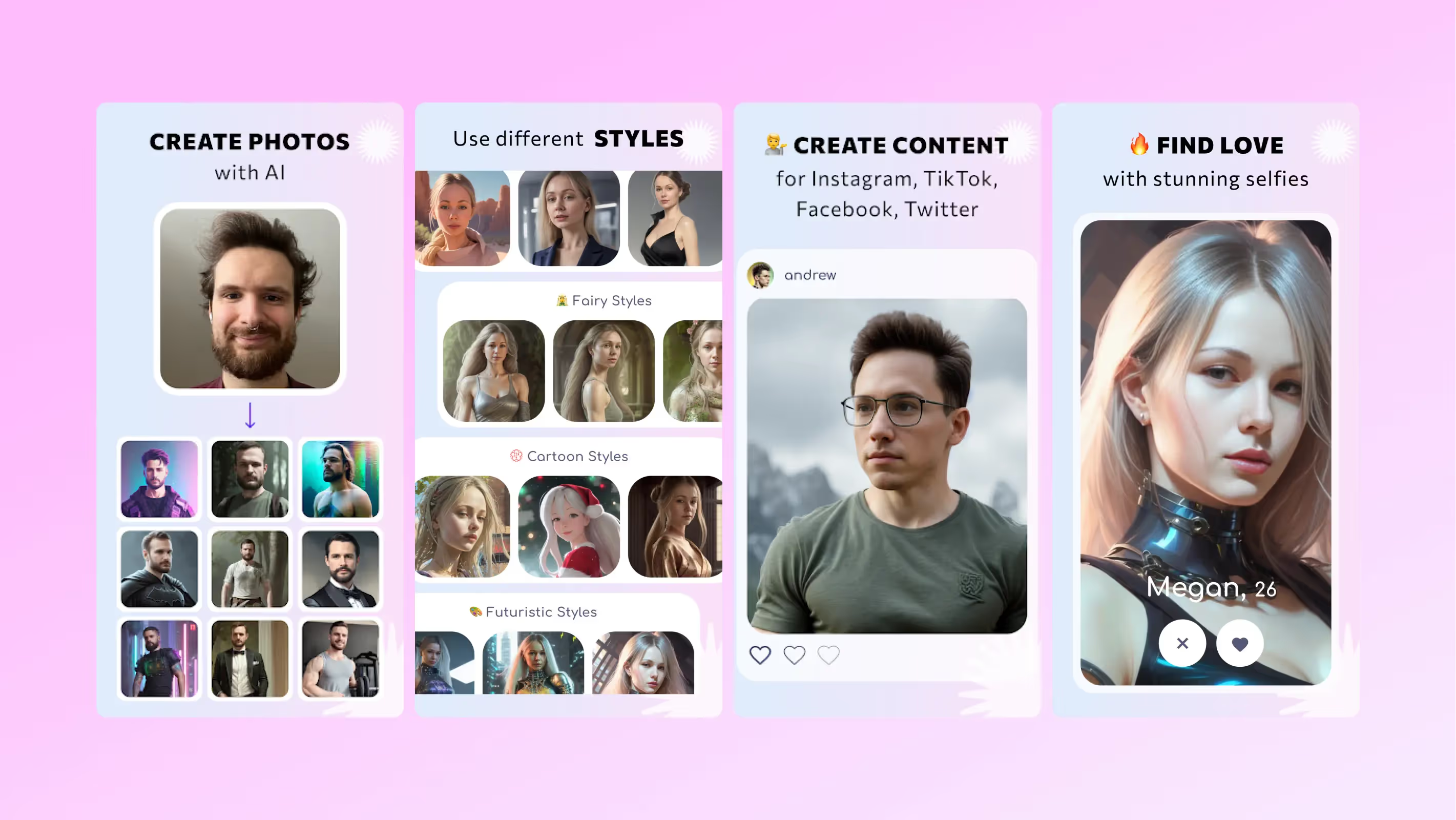
Dyvo, an AI avatar generation app by Sommo, highlights the app usage workflow in the first 2 screenshots. Then, we include screenshots that depict the app’s unique value proposition and key features.
Tools to create app store screenshots
You need software tools to create engaging and professional app screenshots. Some app providers outsource screenshot production to graphic design firms, while others take it upon themselves for such tasks. If you opt for the latter, these free and paid screenshots editing software programs might help.
Figma (free)
Figma is an online editing tool that runs from the browser and is free to use. Despite its simplicity, Figma boasts various helpful features and templates that aid in creating professional-looking screenshots. It’s a good alternative for those shying away from heavyweights like Adobe Photoshop.
AppLaunchpad (free)
AppLaunchpad is a free screenshot-generating app that lets you create beautiful images for your app listing. It is pre-installed with several screenshot templates, which help you create customized app screenshots. Then, the app lets you export the screenshots to the desired resolution.
Placeit (from $7.47 /mo)
Placeit is a paid alternative for creating professional and conversion-driven app screenshots. You’ll find a good variety of libraries and templates that let you style and export in-app images with engaging captions.
Hotpot (paid)
Hotpot lacks the advanced features of other premium image editing tools, but it’s good enough for generating screenshots for simple apps.
Upload Screenshots to the App Stores
Once your screenshots are ready, you submit them for Apple’s approval. To do that, visit App Store Connect, navigate to your app listing, and click the plus button on the left panel.
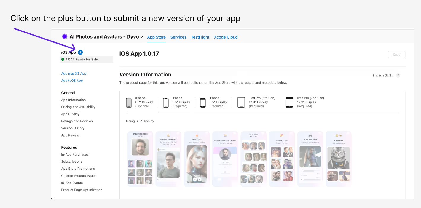
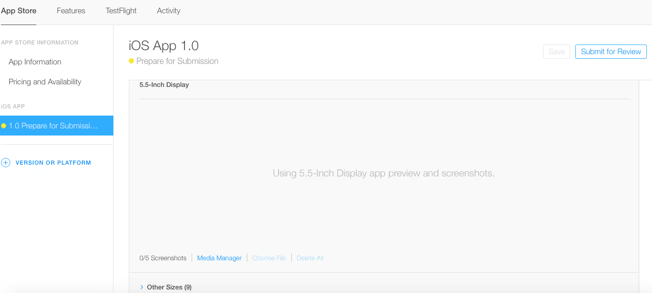
Then, upload and submit the new screenshots. When replacing existing screenshots, Apple requires you to submit a new version of the app.
Summary
Publishing professionally-created screenshots help increase App Store conversion. We recommend these screenshot submission steps to improve app visibility and downloads systematically.
- Study and adhere to Apple’s screenshots recommendations and size guidelines.
- Research your competitor’s screenshots and strategies when localizing apps to different regions.
- Use A/B testing to gauge conversion metrics of different screenshot variants. Then, improve your screenshot designs with the results.
Notably, designing and preparing screenshots for submissions takes a lot of work. Furthermore, Apple is strict and unmoving when approving or rejecting applications. Hence, you must be meticulous to ensure the screenshots comply with the permitted size, content, and style.
Alternatively, we recommend building your iOS apps with Natively. Natively is a no-code application development platform that allows you to publish an app update without submitting them to App Store. It saves the hassle of recurring submissions for new updates.
Talk to us if this approach intrigues you.


.avif)


.avif)


